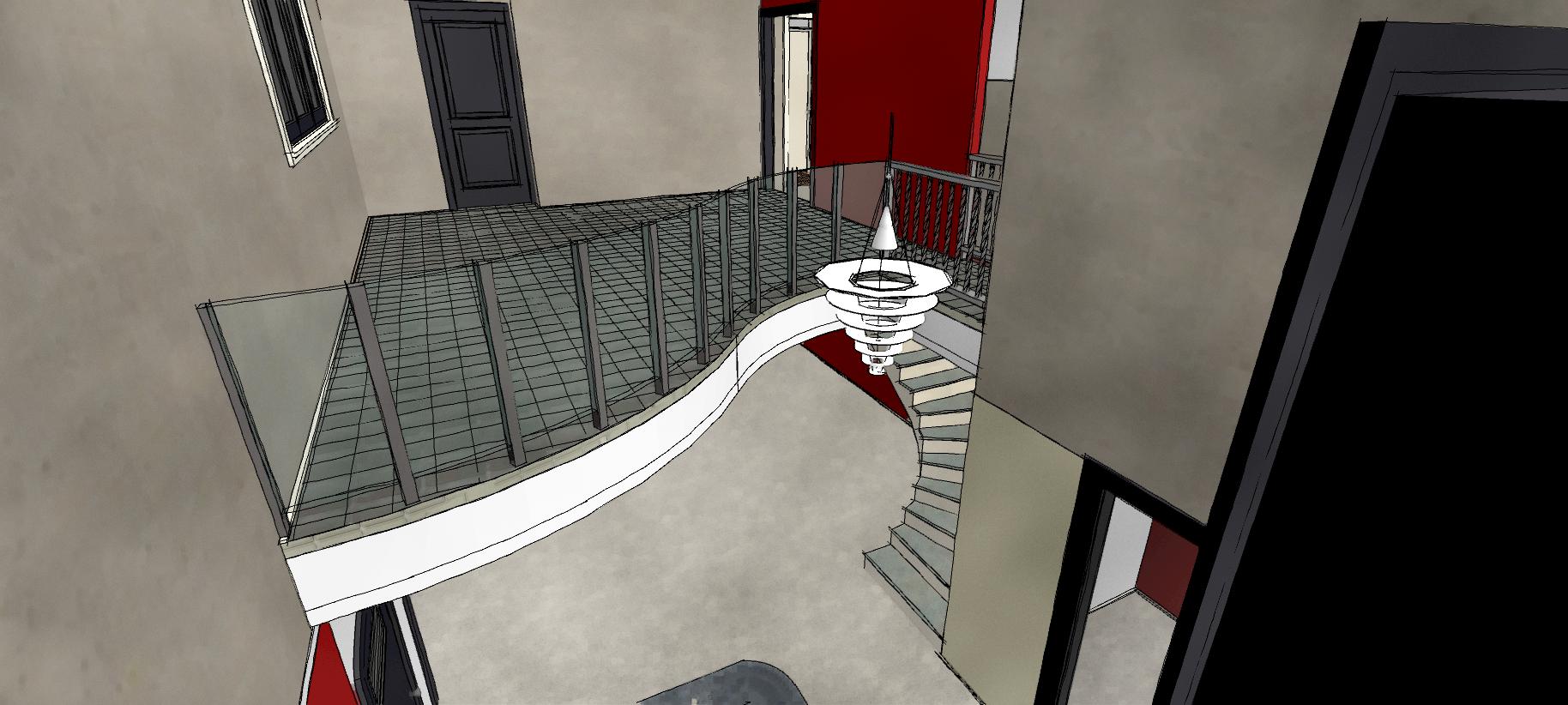
Curved SERPENTINE upper floor created a recessed double height volume at the entrance
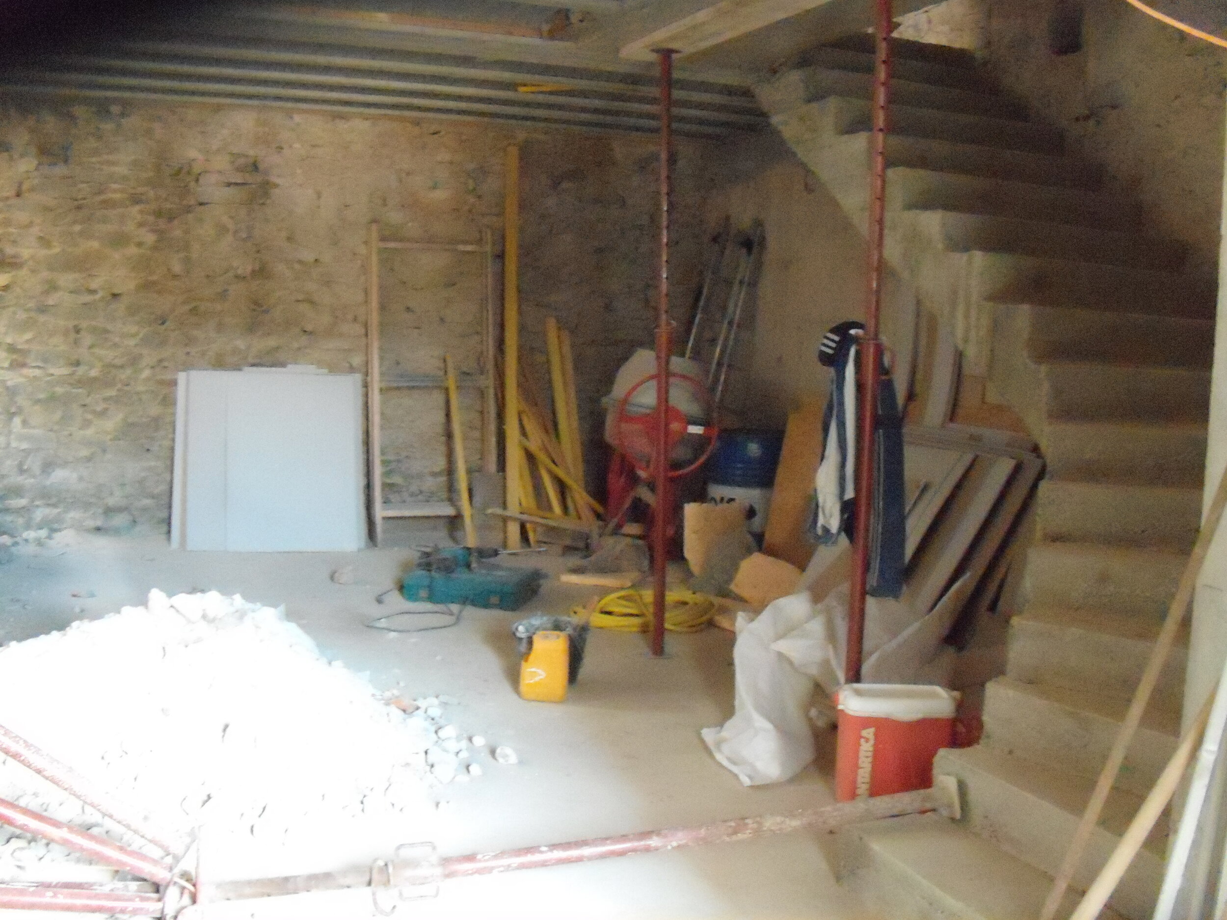
“The serpentine upper floor rests structurally on an old wine cuve, which has been turned into a display walk-in wine cave.”
Quality dining is as much about the surroundings as the food. This commercial restaurant project doubled the available covers, created a contemporary internal space and extended the season with significant commercial impact.
The client already had an architects plan, but was not happy with the outcome. We wanted to revisit the creative possibilities. Our creative concept was driven by a number of simple objectives. We wanted to maximise the commercial impact, creating more dining covers, but also to create an exciting dining interior. We looked at all the assets on the site.
Managing light is one of the most important considerations in good design
One major problem was light, with only a single barn door entrance and one window on the upper floor over the entrance. We needed to find a way to maximise the light.
recessing the upper floor meant that the font entrance and window ABOVE became light for both FLOORS.
the serpentine curved upper floor projects the double height volume into the RESTAURANT. IT'S now easier to see into the floor above CREATING interest.
We decide to recess the upper floor which immediately shared the light from both the main entrance and the window above it. This solved the issue of light and created a dramatic double height entrance. We made the upper floor a curved serpentine shape. The departure point for the curve being the bar area below and the terminal point being the staircase. This projected the double height volume into the restaurant from the main door, drawing the eye into the interior volume and making it easier to see the upper floor from the entrance area.
the double height space creates a drama at the entrance and connects the upper and lower floors though the same volume.
The recessed serpentine curved upper floor gave a double height space at the entrance. This made the space more inviting and dramatic, focussing attention on the entrance bar.
The curve of the upper floor was reflected in the curved stairs which were an homage to the traditional curved Languedocienne stairs, typical in village houses. We cut a hole into the existing concrete wine cuve and added a frameless glass door to create a feature wine cave. A real focal point at the entrance.
We demolished an interior supporting wall to access a small courtyard, which had been completely omitted from the original architects plans. We incorporated it as a conservatory dining space, adding more light and a completely different ‘zone’ in the dining options.
See it and try it for yourself if you are in the area. Highly recommended great food from a talented chef. Click here
CURVED UPPER FLOOR WITH DOUBLE HEIGHT
VISUALISATION FROM THE CONCEPT
Practical design insights:
Serpentine curved upper floor and double height volume
Wine cuve retained as feature walk-in wine store
Zinc topped bar
Conservatory dining zone
Upper floor private dining zone
Curved staircase and balustrade


